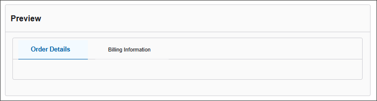
Tabs
The Tabs Component lets you organize content into multiple tabbed sections. This is especially useful for breaking up large forms into more digestible parts, improving usability and focus by displaying one section at a time.
The configuration options are grouped into:
-
Display
-
Conditional
Display
| Parameter | Description |
|---|---|
| Label | A title for the tabs component that appears above the tabbed sections. |
| Tabs | Define the individual tabs by setting their label (what the user sees) and key (internal reference). |
| Custom CSS Class | Allows you to apply custom styling via a CSS class. |
| Hidden | Hides the entire tabs component from view without deleting it. |
| Vertical Layout | Displays the tabs vertically instead of the default horizontal layout. |
Conditional
| Parameter | Description |
|---|---|
| This Component should display | True - the component will display in the form. False – the component will not display. |
| When the form component | Select what component within the form will execute the condition. For example, Submit. |
| Has the value | The data entry of the field that executes the condition. |