HTML Element
The HTML Element Component allows users to insert custom HTML elements within a form template. It supports defining an HTML tag (e.g., <p>, <div>), applying CSS classes, adding attributes, and specifying content. This component is useful for embedding static text, custom styling, or additional structural elements within the form layout.
The options available to configure the HTML element are separated into two categories:
-
Display
-
Conditional
Display
| Parameter | Description |
|---|---|
| Label | The label appears next to a form input field and describes its purpose clearly. |
| HTML Tag | The corresponding Tag to this HTML element |
| CSS Class | CSS class for this HTML element |
| Attributes | This section allows you to define custom HTML attributes for the element. Each attribute has a name (e.g., id, data-role, aria-label) and an associated value. These attributes help customize the behavior and accessibility of the HTML element. |
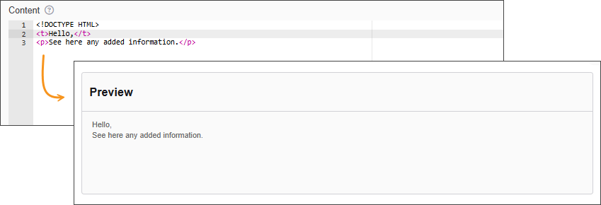
| Content | This field contains the actual content inside the HTML element. For example, if the element is a <p> tag, this field would hold the paragraph text. |
| Refresh on Change | Tick this option to rerender the field whenever a value on the form changes. |
| Custom CSS Class | Custom CSS class to add to this component. |
| Hidden | A hidden field that is still a part of the form but is hidden from the user’s view. |
Conditional
| Parameter | Description |
|---|---|
| This Component should display | True - the component will display in the form. False – the component will not display. |
| When the form component | Select what component within the form will execute the condition. For example, Submit. |
| Has the value | The data entry of the field that executes the condition. |