Number
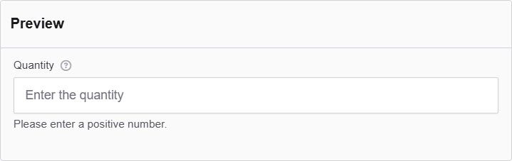
The Number component in Authorium's form builder is an input element that allows users to enter only numeric values. This component is commonly used for collecting information such as ages, quantities, prices, and other data that requires a numeric format.
The options available to configure the Number elements are separated into four categories:
- Display
- Data
- Validation
- Conditional
Display
| Parameter | Description |
|---|---|
| Label | The label appears next to a form input field and describes its purpose clearly. |
| Placeholder | The placeholder text that will appear when this field is empty. It shows an example of what should be inserted. |
| Description | The description is text that will appear below the input field. |
| Tooltip | Enter the text here that will appear as a tooltip to the side of this field. |
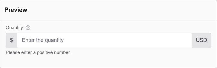
| Prefix | Add a text before the input field. |
| Suffix | Adds a text after the input field. |
| Display Mask | A display mask helps to display the input in a readable way, so this won't affect the value that will be saved (to affect both view and saved value, delete Display Mask and use Input Mask). 9: numeric a: alphabetical *: alphanumeric |
| Input Mask | An input mask helps the user with input by ensuring a predefined format. 9: numeric a: alphabetical *: alphanumeric Examples: Date (MM/DD/YYYY) Input Mask: 99/99/9999 Example Input: 03/15/2025 Social Security Number Input Mask: 999-99-9999 Example Input: 123-45-6789 Currency (USD) Input Mask: $9,999.99 Example Input: $1,234.56 Time (12-hour) Input Mask: 99:99 aa Example Input: 08:30 PM |
| Custom CSS Class | Custom CSS class to add to this component. |
| Autocomplete | Indicates whether input elements can have their values automatically completed by the browser by default. |
| Hidden | A hidden field that is still a part of the form but is hidden from the user’s view. |
| Hide Label | Hide the label of this component. This allows you to show the label in the form builder but not when it is rendered. |
| Hide Input | This hides the input in the browser and does not encrypt it on the server. Note Please don't use it for passwords. |
| Initial Focus | Make this field the initially focused element of this form. |
| Disabled | Disables the form input. |
Data
| Parameter | Description |
|---|---|
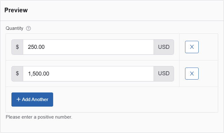
| Multiple Values | Check this to add multiple text boxes and values to be entered for this field. You can add as many as you want. |
| Default Value | The Default Value will be the value for this field before user interaction. Having a default value will override the placeholder text. |
| Use Thousands Separator | Separate thousands by local delimiter. |
| Decimal Places | The maximum number of decimal places. |
| Require Decimal | Check the option allow always show decimals, even if trailing zeros. |
| Truncate Multiple Spaces | Check the option not to allow multiple spaces to happen. |
| Clear Value When Hidden | When a field is hidden, clear the value. |
Validation
| Parameter | Description |
|---|---|
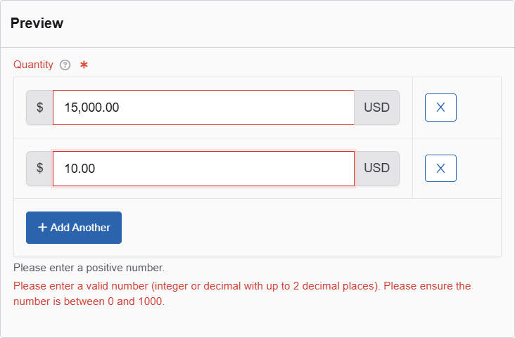
| Required | Check this to make this field as required. The user must fill it out before the form can be submitted. |
| Validate When Hidden | Check this to validate the component when it is hidden/conditionally hidden. Validation errors are displayed in the error alert on the form submission. |
| Minimum Value | Enter a minimum allowable value for this field. |
| Maximum Value | Enter a maximum allowable value for this field. |
| Error Label | The label for this field when an error occurs. |
| Custom Error Message | Error message displayed if any error occurred. |
Conditional
| Parameter | Description |
|---|---|
| This Component should display | True - the component will display in the form. False - the component will not display. |
| When the form component | Select what component within the form will execute the condition. For example, Submit. |
| Has the value | The data entry of the field that executes the condition. |