Button
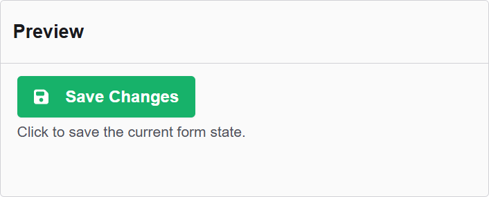
The Button component in Authorium's form builder allows users to perform actions such as submitting the form, resetting data, or triggering custom logic. It is a versatile element that enhances form interactivity and control.
The options available to configure the Button elements are separated into two categories:
- Display
- Conditional
Display
| Parameter | Description |
|---|---|
| Label | The label appears next to a form input field and describes its purpose clearly. |
| Save On Enter | Use the Enter key to submit form. |
| Theme | The color theme of this button. |
| Size | The size of this button. |
| Block Button | This control should span the full width of the bounding container. |
| Left Icon | This is the full icon class string to show the icon. Example: 'fa fa-plus' |
| Right Icon | This is the full icon class string to show the icon. Example: 'fa fa-plus' |
| Shortcut | Shortcut for this component. |
| Description | The description is text that will appear below the input field. |
| Tooltip | Enter the text here that will appear as a tooltip to the side of this field. |
| Custom CSS Class | Custom CSS class to add to this component. |
| Disable on Form Invalid | This will disable this field if the form is invalid. |
| Hidden | A hidden field that is still a part of the form but is hidden from the user’s view. |
| Initial Focus | Make this field the initially focused element of this form. |
| Disabled | Disables the form input. |
Conditional
| Parameter | Description |
|---|---|
| This Component should display | True - the component will display in the form. False - the component will not display. |
| When the form component | Select what component within the form will execute the condition. For example, Submit. |
| Has the value | The data entry of the field that executes the condition. |