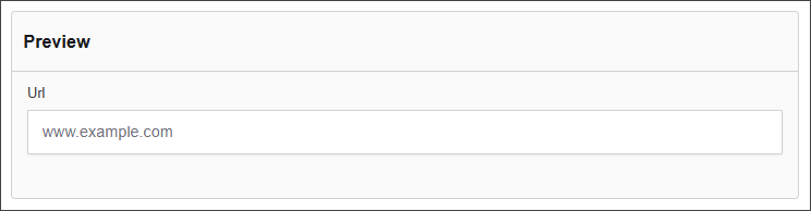
URL
The URL component allows users to input web addresses, automatically validating the format to ensure correctness. This component is essential for collecting accurate hyperlinks within forms, such as personal websites or resource links.
The options available to configure the URL component are separated into four categories:
- Display
- Data
- Validation
- Conditional
Display
| Parameter | Description |
|---|---|
| Label | The name shown on the form for this field (e.g., "URL"). Required. |
| Placeholder | Text displayed inside the input box before the user types anything (e.g., www.example.com). |
| Description | Additional help text shown below the field to guide users. |
| Tooltip | A small message that appears when users hover over an info icon beside the field label. |
| Prefix | Text automatically shown before the input (e.g., "https://"). |
| Suffix | Text automatically shown after the input (e.g., ".com"). |
| Display Mask | A pattern or format guide for how the input should appear (e.g., "999-999-9999" for phone numbers). |
| Custom CSS Class | Allows you to apply custom styling by specifying a CSS class name. |
| Autocomplete | Controls browser autocomplete. Common values: on, off, email, url, etc. |
| Hidden | If checked, the field will not be visible on the form, but the data will still be submitted. |
| Hide Label | Hides the label text visually, but the field remains visible. Useful for screen reader accessibility. |
| Hide Input | The field is visible but the input itself is hidden (often used for conditional logic). |
| Initial Focus | If checked, this field will automatically be focused when the form loads. |
| Allow Spellcheck | Enables or disables browser spellcheck on this input. |
| Disabled | Makes the field read-only so users cannot interact with it. |
Data
| Parameter | Description |
|---|---|
| Multiple Values | Allows users to input more than one email address in this field. |
| Default Value | Pre-populates the field with a default value when the form loads. Note that this will override the placeholder text. |
| Truncate Multiple Spaces | Collapses multiple spaces into a single space within the input. |
| Clear Value When Hidden | Automatically clears the field's value if the component becomes hidden. |
Validation
| Parameter | Description |
|---|---|
| Required | Makes this field mandatory before form submission. |
| Unique | Ensures the entered value has not been submitted before. |
| Validate When Hidden | Validates the field even when it is not visible on the form. |
| Minimum Length | Sets the smallest number of characters allowed. |
| Maximum Length | Limits the input to a maximum number of characters. |
| Regular Expression Pattern | Validates input against a custom regex pattern. |
| Error Label | Custom label shown when a validation error occurs. |
| Custom Error Message | Displays a personalized message when the field fails validation. |
Conditional
| Parameter | Description |
|---|---|
| This Component should display | True - the component will display in the form. False - the component will not display. |
| When the form component | Select what component within the form will execute the condition. For example, Submit. |
| Has the value | The data entry of the field that executes the condition. |