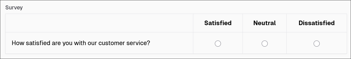
Survey
The Survey component facilitates the creation of questionnaire-style inputs within a form. It supports multiple question types and response options, enabling the collection of structured feedback or data from users.
The options available to configure the Survey component are separated into four categories:
- Display
- Data
- Validation
- Conditional
Display
| Parameter | Description |
|---|---|
| Label | Text label that appears next to the input field. |
| Description | Additional guidance text shown below the input. |
| Tooltip | Helper text displayed on hover for quick hints. |
| Custom CSS Class | Pattern used to format user input visually as they type. |
| Autocomplete | Enables or disables browser autocomplete suggestions. |
| Hidden | Keeps the component data but hides it from the user view. |
| Hide Label | Hides the field label on the rendered form. |
| Initial Focus | Sets this field as the first one focused when the form loads. |
| Disabled | Prevents the user from editing the input field. |
Data
| Parameter | Description |
|---|---|
| Questions | Defines a list of options for fields that collect question-based input (e.g., survey items). Each entry includes: - Label: The text shown to users as the question. - Value: The internal value stored when this question is selected. - Tooltip: A small helper message shown when hovering over an info icon. |
| Values | Defines the available answers or options corresponding to the questions. Each entry includes: - Label The text shown to users as the answer option. - Value The actual value submitted/stored when this answer is selected. - Tooltip Optional helper text shown to explain the answer choice. |
| Default Value | Pre-populates the field with a default value when the form loads. Note that this will override the placeholder text. |
| Clear Value When Hidden | Automatically clears the field's value if the component becomes hidden. |
Validation
| Parameter | Description |
|---|---|
| Required | Makes this field mandatory before form submission. |
| Unique | Ensures the entered value has not been submitted before. |
| Validate When Hidden | Validates the field even when it’s not visible on the form. |
| Error Label | Custom label shown when a validation error occurs. |
| Custom Error Message | Displays a personalized message when the field fails validation. |
Conditional
| Parameter | Description |
|---|---|
| This Component should display | True - the component will display in the form. False - the component will not display. |
| When the form component | Select what component within the form will execute the condition. For example, Submit. |
| Has the value | The data entry of the field that executes the condition. |