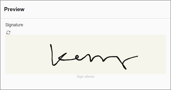
The Signature component enables users to capture their handwritten or stylized signature directly within a form. This feature is ideal for applications requiring user authentication, consent, or agreements, providing a secure and easy way to collect digital signatures.
The options available to configure the Survey component are separated into four categories:
- Display
- Data
- Validation
- Conditional
Display
| Parameter | Description |
|---|
| Label | Text label that appears next to the input field. |
| Footer Label | Instructional text shown below the signature area (e.g., "Sign above"). |
| Background Color | Defines the canvas background color where the signature is drawn. |
| Pen Color | Sets the color of the pen used for drawing the signature. |
| Description | Additional guidance text shown below the input. |
| Tooltip | Helper text displayed on hover for quick hints. |
| Custom CSS Class | Pattern used to format user input visually as they type. |
| Hidden | Keeps the component data but hides it from the user view. |
| Hide Label | Hides the field label on the rendered form. |
| Disabled | Prevents the user from editing the input field. |
Data
| Parameter | Description |
|---|
| Clear Value When Hidden | Automatically clears the field's value if the component becomes hidden. |
Validation
| Parameter | Description |
|---|
| Required | Makes this field mandatory before form submission. |
| Validate When Hidden | Validates the field even when it’s not visible on the form. |
| Error Label | Custom label shown when a validation error occurs. |
| Custom Error Message | Displays a personalized message when the field fails validation. |
Conditional
| Parameter | Description |
|---|
| This Component should display | True - the component will display in the form.
False - the component will not display. |
| When the form component | Select what component within the form will execute the condition. For example, Submit. |
| Has the value | The data entry of the field that executes the condition. |