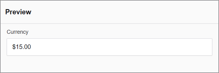
Currency
The Currency component allows users to enter monetary values, automatically formatting the input according to specified currency standards. This is essential for forms dealing with financial transactions, budgets, or pricing information.
The options available to configure the Currency component are separated into four categories:
- Display
- Data
- Validation
- Conditional
Display
| Parameter | Description |
|---|---|
| Label | Text label that appears next to the input field. |
| Placeholder | Placeholder text displayed when the field is empty. |
| Description | Additional guidance text shown below the input. |
| Tooltip | Helper text displayed on hover for quick hints. |
| Prefix | Text or symbol shown before the input (e.g., @, $). |
| Suffix | Text or symbol shown after the input (e.g., .com, kg). |
| Display Mask | A display mask helps to display the input in a readable way. This won't affect the value which will be saved (to affect both view and saved value, delete Display Mask and use Input Mask). 9: numeric a: alphabetical *: alphanumeric Example telephone mask: (999) 999 - 999 |
| Custom CSS Class | Pattern used to format user input visually as they type. |
| Autocomplete | Enables or disables browser autocomplete suggestions. |
| Hidden | Keeps the component data but hides it from the user view. |
| Hide Label | Hides the field label on the rendered form. |
| Hide Input | Hides the input field from the UI (data is still captured). |
| Initial Focus | Sets this field as the first one focused when the form loads. |
| Allow Spellcheck | Enables the browser's built-in spellchecking. |
| Disabled | Prevents the user from editing the input field. |
Data
| Parameter | Description |
|---|---|
| Multiple Values | Allows users to input more than one email address in this field. |
| Default Value | Pre-populates the field with a default value when the form loads. Note that this will override the placeholder text. |
| Currency | Select from Iso-4217 Codes Values for Currency. |
| Text Case | Sets how text is formatted: Mixed (default), Uppercase, or Lowercase. |
| Truncate Multiple Spaces | Collapses multiple spaces into a single space within the input. |
| Clear Value When Hidden | Automatically clears the field's value if the component becomes hidden. |
Validation
| Parameter | Description |
|---|---|
| Required | Makes this field mandatory before form submission. |
| Unique | Ensures the entered value has not been submitted before. |
| Validate When Hidden | Validates the field even when it’s not visible on the form. |
| Error Label | Custom label shown when a validation error occurs. |
| Custom Error Message | Displays a personalized message when the field fails validation. |
Conditional
| Parameter | Description |
|---|---|
| This Component should display | True - the component will display in the form. False - the component will not display. |
| When the form component | Select what component within the form will execute the condition. For example, Submit. |
| Has the value | The data entry of the field that executes the condition. |